Lonevi
The Lonevi home page no longer promises what isn't there
The studio's experience for anyone commissioning a health-focused digital product: how a first screen takes a visitor straight to the right section, and why the page got lighter along the way.

On 18 October lonevi.com got a new home page. The old one was built when Lonevi was only a personal account. Since then the product has gained science reviews, catalogs of publications, clinical trials and drugs, a section for clinics and a shop, while the home page still pointed to the account alone. The new page works in Russian, English and Kazakh.
Four ways in instead of one
The slider at the top stays, with four new slides: each carries one idea and one button. The first leads to Science, the second to sign-up and then into the account, the third to the page for clinics, the fourth to a sign-up for the shop opening.
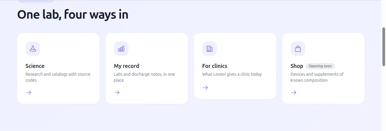
Below them stand four cards: Science, My record, For clinics and Shop. The shop is marked «Opening soon» and gets its own section only once it holds real product cards. The site footer is laid out by the same four directions.
The catalogs are counted on every load
The «What's new in longevity science» block shows how many publications, clinical trials and drugs the catalogs hold. These counters are not typed into the layout: the page reads them from the product's API when it loads, hides a counter at zero, and keeps the label without a number if the read fails. The feed follows the page language; the Kazakh version shows the English pieces.
Seven blocks that promised more than the product delivers went with the old page: an empty coloured band, a second first screen, an embedded chat, empty cards, and the lines «thousands of studies», «free forever» and an «87/100» score. There are no testimonials, partner logos or prices on the page.
What the doctor gets
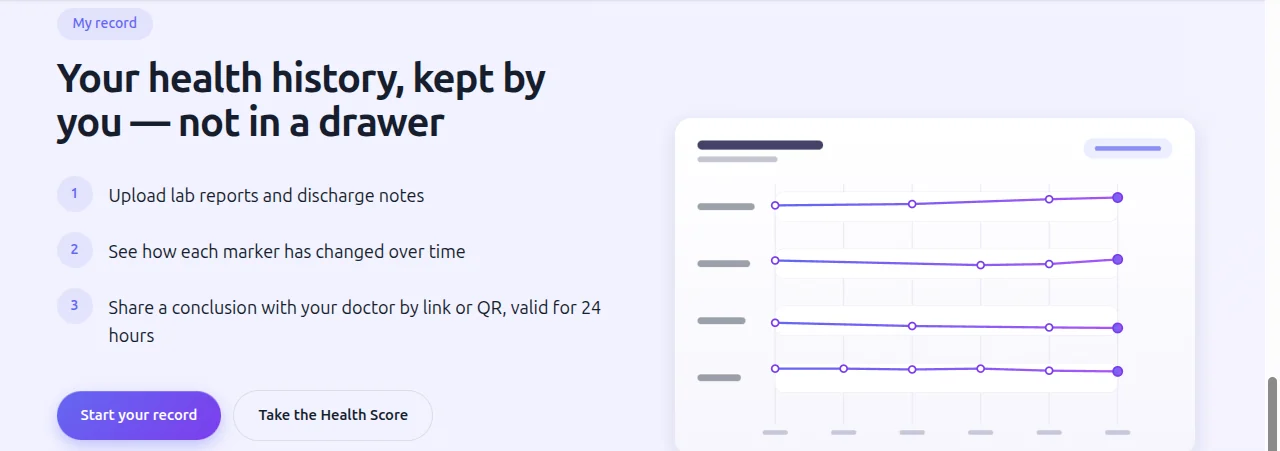
The My record block describes the account in three steps: upload lab reports and discharge notes, see how each marker has changed over time, and share your conclusion with a doctor by link or QR code. The link opens one conclusion and is valid for 24 hours. The clinics page was rewritten the same day in the same words: opening the data is the patient's decision.
Almost half the browser code
The home page no longer shows a loading indicator before its content: the first slide arrives in the very first part of the page. The shared browser code went down from 171 to 89.6 KB, and the first load of the home page from 242 to 171 KB, because the error-reporting service now starts after the page has loaded rather than before.
What stayed the same: the caption «A laboratory project, not a medical service» on the first screen, the line saying Lonevi does not diagnose or prescribe, and the emergency line in the footer.